Tips & tricks · Apps · Browser · ~5 min a day · 2 min read
Vertical tabs: on a wide monitor, read names, not icons
Last reviewed:
In this article
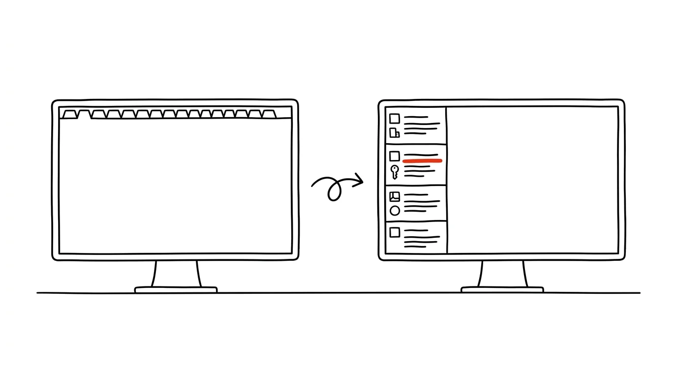
At fifteen tabs or more, the top bar turns into a row of identical little teeth: titles shrink to nothing and all that's left are icons you have to guess between. Yet today's monitors are wide — there's plenty of free space on the sides, while tabs fight for room up top. Vertical tabs address exactly that: the list of open pages moves into a column at the left edge, where every title fits in full. Edge has had it for years, Firefox since version 136; only Chrome still lacks it natively.
How to do it
- Edge: right-click any tab and choose Turn on vertical tabs, or use the shortcut Ctrl + Shift + , — the same path turns it back off, so the experiment costs you nothing.
- Firefox: right-click the tab bar and choose Turn on Vertical Tabs (or go to Settings → General → Browser Layout).
- The tab column can be collapsed into a narrow strip of icons — it expands when you hover over it. On a smaller monitor you don't lose width, and you get readable titles on demand.
- Everything else works the same as before: dragging, tab groups, pinning, and the Ctrl+Tab shortcut. Only pinned tabs in Edge show up as a neat grid of icons at the top of the column.
- Give it two days. The first hour feels unfamiliar — your eyes drift up, where there's nothing. Then you'll notice you're reading tabs for the first time in years. And if the habit doesn't stick, going back is just as fast as turning it on — one option in the same menu.
A typical scenario
A developer has documentation for three libraries open, four pull requests, and a local app. In the top bar they're indistinguishable icons — half the tabs are from the same site, so even the favicon is the same. In the vertical column he reads the full titles: “PR #142: fix login,” “PR #143: database migration.” He switches with certainty, not trial and error.
A marketer with thirty research tabs open appreciates that the column behaves like a list: new tabs get added at the bottom, related ones stay together, and nothing shrinks into invisibility — the thirtieth tab is just as readable as the first.
What you get out of it
Switching between many tabs stops being a guessing game — you see full names, so you hit the right tab on the first try. And a wide monitor finally gets used where it has room to spare, instead of cramming everything into one overcrowded row at the top.
Pro tip
Vertical tabs shine most when combined with collapsing: leave the column collapsed to icons and expand it only by hovering, when you're looking for a specific tab. You get the readability of a list without sacrificing a single centimeter of page width.
Want to go deeper? The handbook has a whole chapter on it — The app categories that matter.
Similar tips
Slim down a presentation: compress images right inside PowerPoint
Presentation is 80 MB and won't go through email? Built-in image compression shrinks it to a fraction of the size — two clicks, no visible loss.
The Selection Pane: click an object hidden under everything else
Can't grab an object buried under an image with your mouse? The Selection Pane lists every element on the slide — pick by clicking in the list, not by hunting on the canvas.
Slide Master: change the font everywhere at once
View → Slide Master controls the look of the whole presentation from one place — fonts, colors, logos.
Was this helpful?
Liked this tip?
I send one like it every week by email. Two minutes to read, hours saved.
The Top 30 tips e-book, free — it lands in your inbox right away.
Then 1 tip a week · no spam · unsubscribe in one click
Prefer a system to single tips? The free email course — seven days, seven emails, one skill a day.