Tips & tricks · AI · Everywhere · ~2 hrs per diagram · 7 min read
SVG diagrams for articles
Last reviewed:
In this article
- When a diagram helps, and when it's wasted work
- Why vector, not a picture
- How to get an SVG generated
- Prompt: ownership structure
- Prompt: timeline
- Prompt: money flow
- Accessibility and contrast
- A diagram is a claim, not an illustration
- How to get it into the article
- A typical scenario
- What you get out of it
- Pro tip
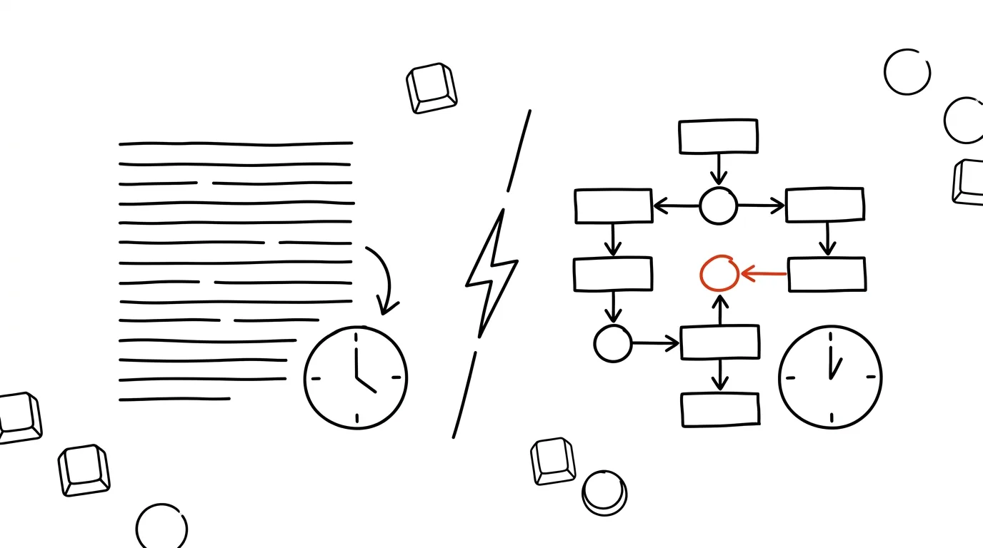
An ownership structure spanning three countries, a twelve-point case timeline, the flow of a subsidy from a ministry to three recipients and back. These are things that read terribly as a paragraph — the reader has to hold five names and two dates in their head, and usually gives up. A diagram delivers the same information at a glance. The problem was always that between “I know what I want to draw” and a finished graphic stood a designer and a day of waiting. A model can generate the diagram directly as SVG, so the path from idea to a usable version takes a few minutes — and, more importantly, so does version six.
When a diagram helps, and when it's wasted work
It pays off when the text contains:
- a relationship among three or more parties — who owns whom, who pays whom, who sits on which board,
- a sequence of events where order and spacing matter — a timeline of who knew what and when,
- the path of money — from source through intermediaries to recipient, especially when the amount changes along the way,
- a process with decision points — what happens if an authority rejects the application,
- a comparison of two states — how it was before a change in the law and how it is after.
It doesn't pay off for two numbers (a sentence will do), for a single comparison (a table will do), or anywhere a diagram would just retell the paragraph without changing its structure. A bad diagram is worse than none — the reader puzzles it out and then finds out they learned nothing.
Why vector, not a picture
An SVG isn't a picture in the usual sense. It's a text file describing shapes, which the browser renders only when the reader opens it. That gives four practical advantages:
- Sharp everywhere. On retina, on a projector, and in print. A raster image falls apart when enlarged; a vector redraws itself. For print, you export a PDF from the SVG, which keeps the vector.
- Editable. Open it in a text editor and fix a typo. Or open it in Inkscape, Illustrator, or Figma and nudge an arrow. You don't need to regenerate the whole image over one name.
- Size. A diagram with twenty elements weighs a few kilobytes. The same graphic as a retina-resolution PNG weighs hundreds.
- Text stays text. Captions can be searched, copied, and read by a screen reader. This is also the biggest difference from a screenshot of a table, which you still run into in articles all the time.
How to get an SVG generated
A model can write SVG directly, but without rules it produces graphics that look fine in the preview and fall apart on the web. So the brief needs five technical conditions — worth keeping in your prompt library and just copying:
- viewBox and no fixed dimensions in pixels, so the diagram adapts to the column width,
- a system font, not a link to a webfont the reader won't have — that is,
font-familywith a generic fallback at the end, - text as text, not converted to outlines (it would be lost to search and to screen readers),
- no scripts and no external links, because editorial systems strip them anyway,
titleanddescelements inside the SVG for accessibility.
A skeleton that matches this looks like this:
<svg xmlns="http://www.w3.org/2000/svg" viewBox="0 0 800 400"
     role="img" aria-labelledby="t1 d1">
  <title id="t1">Money flow for Project Alpha</title>
  <desc id="d1">The ministry sent 40 million crowns to the region,
    which split the funds among three recipients.</desc>
  <style>
    .lbl { font-family: Georgia, "Times New Roman", serif;
           font-size: 16px; fill: #111; }
  </style>
  <rect x="20" y="20" width="200" height="60" rx="6"
        fill="#eef2f7" stroke="#334155"/>
  <text class="lbl" x="40" y="56">Ministry</text>
</svg>
Prompt: ownership structure
Create a diagram as clean SVG. Use only the data I give you
— don't add or calculate anything on your own.

Content: ownership structure. Nodes and edges:
[company A — owns 60% — company B]
[company C — owns 40% — company B]
[company B — owns 100% — company D, headquartered in Cyprus]

Technical requirements:
- viewBox 0 0 900 500, no fixed width or height
- font-family with a generic fallback at the end, size
  at least 15px
- text as a text element, never as outlines
- no scripts, no external links, no raster images
- title and desc elements, role="img" attribute
- arrows point in the direction of ownership, percentages on
  the edge
- distinguish foreign entities by shape OR pattern, not color
  alone

Return only the SVG code, and below it a list of every text
string in the diagram, so I can check it against my source
material.
That last sentence is a small thing that saves the most headaches: a list of captions reads faster than code, and you'll spot a typo in a company name in it right away.
Prompt: timeline
Create a horizontal timeline as SVG from these events:
[date — event — source]
[date — event — source]
…

Rules:
- spacing on the axis must match the real gaps between dates,
  not be spread out evenly
- mark years as labels below the axis
- alternate events above and below the axis so labels don't
  overlap
- if two events are less than [X] days apart, merge them into
  one point with two lines of text
- viewBox, system font, text as text, title and desc

Below the code, list anything you had to shorten for space.
Evenly spaced points are the most common silent lie in timelines: two weeks and two years look the same, and the reader walks away with a completely different story. An explicit ban belongs in the brief.
Prompt: money flow
Create a money-flow diagram as SVG.

Nodes and amounts:
[source — amount — recipient]
…

Rules:
- arrow width corresponds to the amount; state in the desc
  what scale you used
- label each arrow with the amount; format numbers with
  thousands separators
- if outgoing amounts don't add up to the incoming amount,
  DON'T FORCE IT TO BALANCE — add an “unspecified” node
  and name the difference in it
- viewBox, system font, text as text, title and desc,
  text contrast against its background of at least 4.5:1

Below the code, list a table: from, to, how much — exactly as
it appears in the diagram.
The rule against forcing a balance is there for a good reason. Models tend to produce diagrams that “add up” even when the input data doesn't — and a diagram where the sum looks right while a quarter of the money is actually missing is a factual error nobody will catch.
Accessibility and contrast
A diagram in an article is also read by someone who can't see it, and by someone who can't tell red from green. Three things address that:
titleanddescelements inside the SVG, and aroleattribute set toimg.titleis the diagram's name,descis a sentence describing what the diagram shows. It isn't a caption under the image — it's what the screen reader announces.- Never convey meaning by color alone. If foreign companies are red and domestic ones are blue, the diagram is blank for some readers. Add a shape, a dashed outline, or a pattern.
- Contrast. Text against its background at least 4.5:1, outlines and lines at least 3:1. Light gray on white looks elegant on the designer's monitor and disappears on a phone on the train.
Check the attached SVG and return a list of problems, don't fix
anything:

1. is title, desc, or role="img" missing?
2. is meaning conveyed anywhere by color alone?
3. calculate the contrast ratio for every text/background color
   combination and flag anything below 4.5:1
4. is any font smaller than 14px anywhere?
5. does the file reference an external font, image, or script?
6. is text stored as outlines instead of a text element?

For each finding, give the line and a specific fix.
A diagram is a claim, not an illustration
This is where journalistic work differs from a slide-deck infographic. Every number, arrow, and name in the diagram is a claim you stand behind exactly as you would a sentence in the text. The practical consequence: a source and date belong under the diagram (“Source: contract register, as of Aug 24, 2026”), just as they would under a table. A model doing the drawing sometimes invents a relationship you don't have in your source material — especially in org charts, where “that's usually how it works.” And when a diagram is built from a document supplied by a source, the same rule applies as for text: names and details that would identify the source don't belong in the material you feed into the generator.
Here is the finished SVG and here is my source material.
Go through the diagram element by element and return a table:

item in diagram | is it in the source material (yes/no) | where exactly

List separately everything that's in the diagram but you can't
find in the source material — including relationships, arrows,
and text labels, not just numbers.
Don't fix anything.
How to get it into the article
The simplest route is to save the file and insert it as an image — most CMSes accept .svg. If yours rejects it, you insert the code directly into the page, except most CMSes don't allow that either; then what's left is exporting a PNG at double resolution as a fallback, with the SVG available as a downloadable file. You can't upload SVG to social media at all — export a PNG for that. And for print, you make a PDF from the same file — one source, three outputs, no redrawing.
A typical scenario
Editor Tomáš has an ownership structure to untangle: five companies, two foreign entities, three levels. In text it took a paragraph even he couldn't read back to himself. He has the data in his notes, so he drops it into the ownership-structure prompt and has an SVG in two minutes. In the caption list he finds that the model listed one company's stake as 40% when the source material says 40.1% — he fixes it directly in the code, since it's just plain text. He runs the accessibility check, which finds gray text at a 3.1:1 ratio and one relationship distinguished by color alone; he fixes both. Finally he runs the check against his source material, which shows that an arrow between two companies isn't backed by anything in the sources — Tomáš deletes it. The designer opens the file, brings it in line with the supplement's visual style, and it's done in ten minutes instead of a day.
What you get out of it
A diagram stops being the thing you never dare request alongside a text because “it's not that important.” The path from source material to a usable version takes a few minutes, and so does the fifteenth version — and it's exactly that ability to rearrange the diagram twenty times that makes the difference between a diagram that helps and one readers have to puzzle out. The designer, meanwhile, doesn't start from zero but from a finished structure they just carry through to a final look.
Following on from the data work behind a diagram is data analysis with AI, for interactive versions artifacts and mini-apps, and for making numbers traceable, fact-checking.
Pro tip
Have a text version of the same diagram generated alongside the SVG — a bulleted list of the relationships. It's a safety net for readers without images, material for a caption, and above all a checklist: if the text version reads oddly, the diagram won't be any clearer, it'll just be less obvious.
Want to go deeper? The handbook has a whole chapter on it — AI and automation.
Similar tips
The Selection Pane: click an object hidden under everything else
Can't grab an object buried under an image with your mouse? The Selection Pane lists every element on the slide — pick by clicking in the list, not by hunting on the canvas.
Slide Master: change the font everywhere at once
View → Slide Master controls the look of the whole presentation from one place — fonts, colors, logos.
Jump to any slide while presenting: type the number, hit Enter
During a slideshow, type a slide number and press Enter — you're there. No clicking back through twenty slides in front of an audience.
Was this helpful?
Liked this tip?
I send one like it every week by email. Two minutes to read, hours saved.
The Top 30 tips e-book, free — it lands in your inbox right away.
Then 1 tip a week · no spam · unsubscribe in one click
Prefer a system to single tips? The free email course — seven days, seven emails, one skill a day.