Tips & tricks · AI · Everywhere · ~a day of analytical work · 19 min read · in-depth guide, doing it ~2 h
Data Analysis with AI: From CSV to a Conclusion You Can Defend
Last reviewed:
Facts verified against the tools:
Change history for this guide →
In this article
- A typical scenario
- Phase 1: data, before AI ever touches it
- Phase 2: AI doesn't calculate in the chat, AI writes a script
- Phase 3: from question to script
- Phase 4: exploring an unfamiliar dataset
- Phase 5: trends and anomalies
- Phase 6: visualization — which chart for what
- Phase 7: interpretation — what the data says, and what it doesn't
- Phase 8: turning a one-off analysis into a routine
- Common mistakes
- The best tools
- What you get out of it
- Pro tip
Between “I have data” and “I know what's in it” there used to stand a knowledge of Excel. Today something trickier stands there instead: the ability to recognize when AI answered you from an actual calculation and when it just wrote down a number that looked right in that sentence.
A language model in a chat window does not calculate. It generates text. Ask it for an average and it doesn't run an adding machine — it writes a value that fits the context. Sometimes that value is even correct, and that's exactly what makes it dangerous. Useful analysis happens differently: the model writes code, the code runs against your file, and the numbers come out of that run. That's the entire difference between “AI calculated my revenue” and “AI wrote a script that calculated my revenue, and will calculate it again.”
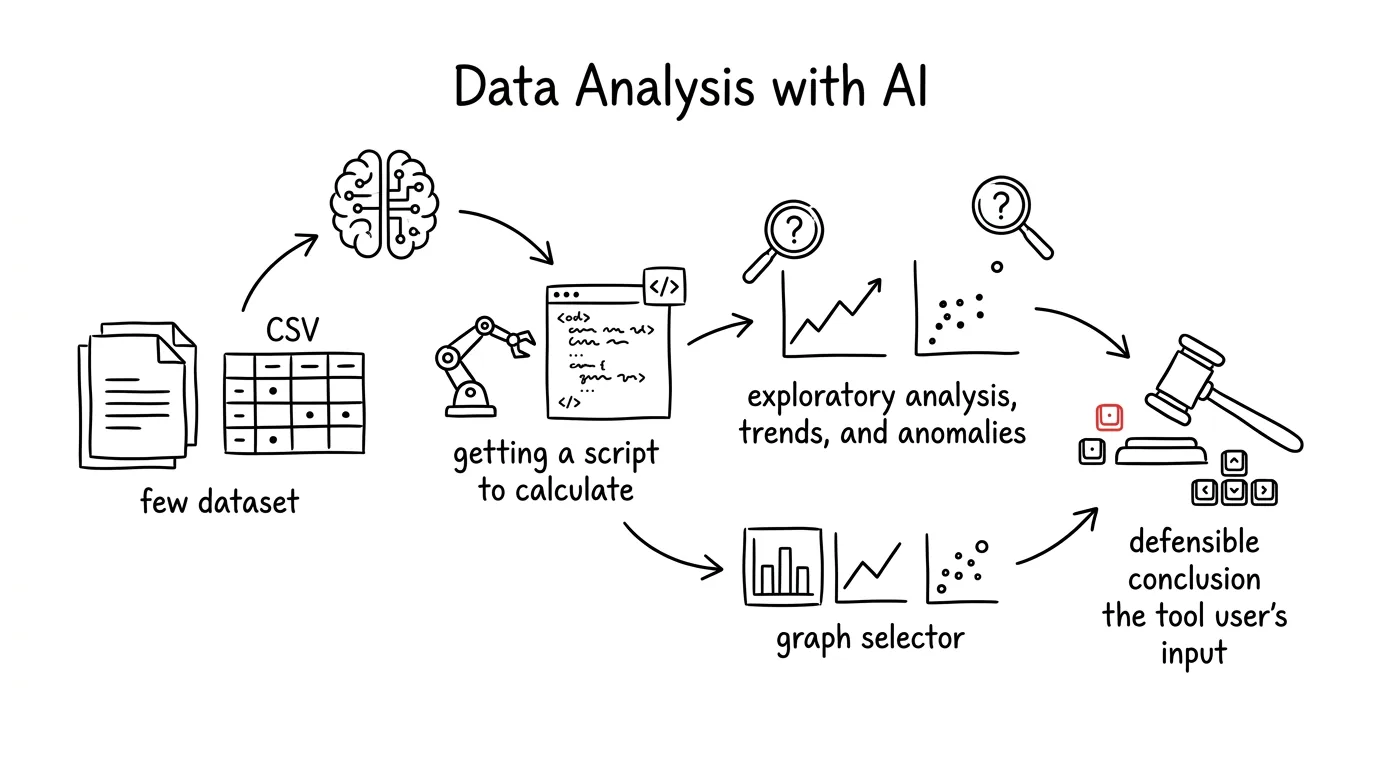
This guide walks from a raw export to a conclusion you can say out loud in a meeting: preparing and anonymizing data, the difference between a chat that talks and a tool that actually executes code, exploring an unfamiliar dataset, hunting for trends and anomalies, choosing a chart, and finally interpretation. Every stage comes with a copy-paste prompt — just fill in the brackets.
A typical scenario
Jana runs an online store selling home goods. In June her revenue dropped twenty-two percent versus May, and her accounting system has an export of orders covering two years: fourteen thousand rows, eighteen columns. The classic scenario: an afternoon lost in pivot tables, two gut-feel hypotheses (“probably vacations,” “probably that new competitor”), and a decision made on a hunch — an across-the-board discount, margins cut, the actual problem still unsolved.
Jana spends her evening differently. First she strips names and emails from the export and has the file checked — it turns out six hundred rows are cancellations that had no business being in the totals. Then she has a script written that breaks revenue down by month, category, and traffic source. The script runs in three seconds and shows what the summary number couldn't: the drop isn't uniform. Two of the four categories are growing, one is flat, and one has fallen sixty percent — starting exactly the week a supplier fell through and half the items in that category went out of stock.
The difference isn't Excel skill. It's that in the second version Jana ends up with a sentence she can defend: “We didn't lose customers, we lost inventory in one category.” And because the analysis runs as a script, she can repeat it next month in ten seconds.
Phase 1: data, before AI ever touches it
Most bad analyses go wrong right here, before the first question is even asked. The model has no way of knowing that the “price” column sometimes includes VAT and sometimes doesn't, that the date format changed in March, or that nobody filtered out the rows marked “cancelled.” It calculates whatever it's given — nonsense included.
What a usable export looks like
The rules are boring, and they decide everything else. One row equals one observation (one order, one day, one respondent) — never a mix of levels. One header on the first row, no merged cells, and above all no subtotals buried inside the data — a “total for March” row sitting among the orders is a classic way to get revenue counted twice.
For exports from local systems, watch three technicalities that break the import: the delimiter (often a semicolon), the encoding (UTF-8, but older systems export Windows-1250 and mangle accented characters), and a decimal comma instead of a period — left unhandled, numbers turn into text. For analysis, prefer CSV over XLSX: workbooks hide extra sheets and color-coded flags that only a human can read, not the data itself.
Don't point your first prompt at calculations — point it at a check. Show the model just the header and a few rows, not the whole file:
Here is the header of my export and the first 20 rows (semicolon
delimiter, UTF-8 encoding, decimal comma):

[paste 20 rows including column names]

Don't do any calculations yet. Do a data audit:
1. For each column, determine its type (text, number, date,
   category) and what it likely means based on the name and values.
2. Flag problem columns: mixed formats, dates stored as text,
   numbers with a unit stuck in the cell, categories spelled
   differently (“Prague”, “prague”, “PRAGUE ”).
3. List what you need to ask me before you start calculating —
   typically whether prices include tax and whether cancelled
   orders should be excluded.
4. State what one observation is in this data.

Don't guess anything — where the sample doesn't give you certainty,
write it as a question for me.
It comes back with a list of ambiguities you'd otherwise only discover once they show up in a chart. Point 3 is the important one: most analysis mistakes aren't calculation errors, they're a case of summing up something other than what the person actually meant. And watch out — the model will sometimes calmly declare that the “total_price” column includes tax. It doesn't actually know that; verify it against the system the export came from.
Anonymization: what never gets uploaded
Orders, payroll, surveys, and bank statements all contain personal data. Before uploading a file anywhere, strip names, emails, phone numbers, addresses, national ID and account numbers, and any open-text answers where people identify themselves. Replace the customer with a sequence number; if you need to trace it back to the original record, keep the key in a file you never send anywhere.
The site's rule applies here: sensitive data belongs only in a paid account with contractual data protection, never in a free chat, and even there without identifiers. For sensitive business figures, ask yourself whether you need to upload the whole table at all — most questions can be answered from an aggregated excerpt. The cleanest option is to have a script written and run it yourself; the data never leaves your machine.
Write a Python script that prepares an anonymized copy of my CSV.
Column structure: [paste just the column names, no data]

The script should:
1. drop the columns [name, email, phone, address],
2. replace [customer_id] with a sequence number and save the
   mapping table to key.csv, which stays with me,
3. in the free-text column [note], only FLAG rows that contain
   an email, phone number, or possible name, and list them for
   review,
4. save data_anonym.csv with the same delimiter and encoding,
   and report how many rows and columns remain.
Run it once and you have a safe copy. Don't leave point 3 fully automated on purpose — deciding what counts as personal data inside a free-text note is a human call. It's a version of the rule AI proposes, a human approves.
Phase 2: AI doesn't calculate in the chat, AI writes a script
The core of this whole guide. If you take away one thing, make it this one.
Two reasons a number from the chat must never drive a decision
The context window. The model only sees a limited slice of text, and for a longer conversation, a much smaller slice than it appears. A table with fourteen thousand rows doesn't fit into it whole — the model takes a chunk of it. You won't get an error message saying “I can't see the rest of the data.” You'll get an answer.
And above all: the model generates text, not a calculation. Asked “what's the average,” it writes down a number that looks like the right answer in that context. That's dangerous precisely because such a number looks completely normal: it fits the expected range, percentages add up to a hundred, the year-over-year change sounds plausible. There's no way to tell it was made up — until someone recalculates it.
The rule is therefore strict: no number that originated as text in a chat may go into a decision, a presentation, or a report. Every value must come from code that can be run again.
When the chat is allowed to calculate: tools that actually run code
The distinction isn't “AI” versus “not AI” — it's “it wrote it” versus “it calculated it.” Modern chat tools can do both, and you have to be able to tell which one just happened. The tell-tale sign: you see code and its output. When a code block runs in the response and there's a printout underneath it (loaded 14,200 rows, removed 612 cancellations, average $58), a machine calculated it. When a nicely worded paragraph full of numbers arrives right away, the model wrote it.
Three places where code actually runs:
- A code-execution tool built into the chat. Upload a CSV, the model writes code and runs it in a sandboxed environment. The fastest path for a one-off analysis.
- Claude Code against a folder of data. The model can see the file, writes a script, runs it, and fixes errors as they come up. The best choice when you expect the data to be messy or you'll be repeating the analysis. More in the tip small scripts without programming.
- Locally, on your own machine. Python installed,
pip install pandas matplotlib,python analysis.py. A slower start, but the data never leaves your computer.
It's worth adding a standing instruction to every analytical conversation that bans guessing:
We're working with my data file. For the whole conversation:

1. Never state a number from memory or estimate it — calculate
   every value with code and show me both the code and its output.
2. When you don't have the data or the tooling to calculate
   something, write “I can't calculate this” instead of an
   approximate answer.
3. For every result, state how many rows it came from and how
   many were excluded, and why.
4. When something is ambiguous (missing values, duplicates,
   suspicious categories), ask — don't decide on your own.
5. At the end of every answer, write one sentence about what
   could be skewing the result.
It looks formal, and it's there for a reason: without points 1 and 2 the model quietly slips into “I'll write whatever fits” mode. Point 3 is insurance against silently dropped rows.
Phase 3: from question to script
How to ask so there's an answer
Analysis isn't about the data, it's about the question. “Take a look and tell me what's interesting” gets you back a paragraph of generalities. Usable questions come in three shapes:
- Descriptive — how much, what share, how is it distributed. (“What share of revenue do the top 10 products make up?”)
- Comparative — does A differ from B, and by how much. (“Do customers who arrived via search have a different average order value than those from social media?”)
- Trend-based — is it changing over time, and when did the break happen. (“Since which week has the number of repeat purchases been declining?”)
You can spot a bad question by the fact that no number could ever answer it. Before you start calculating, have a vague question turned into measurable ones (the prompt for that is in Phase 4) — it usually turns out that “why are people buying less” needs data you don't have, while “exactly who is buying less” can be answered right away.
The prompt that produces an analysis script
Show the model the structure, not the whole file:
Here's the header of my CSV (first 5 rows, semicolon delimiter,
UTF-8 encoding, decimal comma):

[paste 5 rows including column names]

Write a Python script (pandas, matplotlib) that:
1. loads the file as data/orders.csv and handles the local
   encoding and decimal comma,
2. cleans the data: drops rows with status [cancelled, unpaid],
   normalizes category spelling, converts [date] to a proper
   date type,
3. prints how many rows it loaded, how many it dropped, and why,
4. calculates revenue, order count, and average order value by
   month, and the same broken down by [category] and [source],
5. saves the numbers to results.csv and the charts to a charts/
   folder as PNG files.

Requirements:
- a comment on every step explaining WHY it's done,
- the script must handle empty cells without crashing,
- no hard-coded numbers — everything calculated from the data,
- print a control total at the end: revenue for the whole period.
It comes back with a finished script, complete with comments that are just as valuable as the code. Paste in the real header, not one typed from memory — an incorrectly guessed delimiter will break the import. And compare the control total against a number you know from somewhere else (accounting, an admin panel). If they don't match, something extra got excluded.
What trustworthy output looks like
Loaded 14,203 rows, 18 columns.
Dropped 612 cancellations and 87 unpaid orders, 13,504 remain.
Missing values: category on 41 rows (kept as “unspecified”).

June breakdown by category (versus May):
category         may        june      change
Kitchen         24,500     23,900       -2.4%
Cleaning        16,700     16,050       -3.9%
Garden          20,400      8,150      -60.1%
Other           12,800      9,970      -22.1%

Control total for the period: $860,200
Results saved: results.csv, charts/revenue-months.png
This is a number allowed into a presentation: you know how many rows went into it, what was excluded, and how it gets recalculated. And it's immediately obvious that the “June drop” is really a drop in one category.
Understanding the script even if you can't write it
Not knowing Python isn't a problem. Not understanding what the script does to your data is a problem — because someone is going to ask.
Explain this script to me block by block, for someone who
doesn't program and doesn't want to learn.

For each block, write:
- what happens in it, in plain language,
- what decision about my data is hiding inside it (what it
  drops, what it fills in, what it rounds),
- what would happen if I skipped it.

Then, separately, list the places where the script could
silently return a wrong number without crashing (missing values,
duplicates, division by zero, a badly parsed date), and 5
questions my boss or a client might ask about this analysis,
along with answers.

[paste the script]
It comes back with a plain-language walkthrough plus a list of silent risks. The section on “silently wrong numbers” typically reveals that duplicate orders are being counted twice, or that rows without a date fell out of the time series.
Phase 4: exploring an unfamiliar dataset
Sometimes you don't have a question, just a file someone sent you. First find out what's in the data — only then what can be pulled out of it.
A data profile as the mandatory first step
Write a Python script that profiles the dataset — I want to know
what I'm working with before I start calculating. It should print:

1. the number of rows and columns,
2. for each column: type, share of missing values, number of
   unique values,
3. for numeric columns: minimum, maximum, mean, median, 1st and
   99th percentile,
4. for text columns: the 10 most common values with counts, and
   a flag for suspiciously similar pairs (identical except for
   spacing or capitalization),
5. for date columns: the earliest and latest date, and any
   missing periods (days or months with zero records),
6. total duplicate count, and duplicates by [key column],
7. rows with nonsensical values: negative prices, age outside
   0-120, dates in the future.

Make the output readable in the terminal, don't fix anything —
just report.
That last sentence matters: profiling must never change the data. You want a diagnosis, not a silent cure. Address the findings one at a time and write down each decision you make (“cancellations out, missing category treated as unspecified”). The missing periods from point 5 tend to be the biggest catch — when a whole week is missing from the data, every “this year versus last year” comparison is off from that point on, and nobody notices.
What can actually be learned from this data
Here's the profile of my dataset (output of the profiling script):

[paste the output]

Context: the data comes from [source], I use it for [purpose],
and I'm vaguely interested in [e.g. why revenue dropped in June].

Don't calculate anything. Propose 12 measurable questions that
CAN be answered from these columns. For each one, write:
- the question in one sentence,
- which columns and what calculation would answer it,
- what result would count as “yes” and what as “no”,
- what decision the answer would help me make.

Then list 5 questions that seem natural but this data can't
answer, and for each one say specifically what's missing.

Finally, mark the three questions I should start with, and
justify the choice.
It comes back with a map of possibilities more valuable than any automated “insights” feature. Watch out for the trap: the model likes to propose questions that sound analytical but lead nowhere (“what's the distribution of column X”). Start with whatever would actually change a decision.
Phase 5: trends and anomalies
Trend, seasonality, and noise
Three numbers in a row are not a trend. Most of the “drops” and “surges” that cause a stir in meetings are ordinary fluctuation — or a calendar artifact. Before you go hunting for causes, separate the long-term direction, the seasonality, and the noise.
Three rules help. Compare year over year, not month over month — June against June. Normalize for the number of business days; February is short, May is often full of holidays, and a ten-percent difference can be entirely down to that. And use a moving average over seven or thirty days to smooth out the noise.
Write a Python script to analyze the time series in my data.
Columns: [date], [value], optionally [segment].

The script should:
1. aggregate the value by day, week, and month,
2. calculate a moving average over 7 and 30 days,
3. calculate a year-over-year comparison (same month last year)
   in percent,
4. normalize monthly values by the number of business days and
   show how much that changes the picture,
5. print a table of days where the value differs from the
   moving average by more than 2 standard deviations,
6. plot a chart: daily values light, the moving average bold,
   the deviations highlighted.

In comments, note what assumptions the method makes and when it
could mislead me (a short series, missing days, a change in how
the data is collected).
It comes back with a script and, most importantly, a table of deviations — days worth taking a closer look at. Point 4 often surprises people: after recalculating for business days, a “drop” shrinks down to two percent. The script isn't a detector of causes, it's a detector of places worth looking.
When you find an anomaly, break it apart
An aggregate number never says why. The answer is almost always in a breakdown by dimension — one category, one region, one channel, one week.
I have this finding in my data: [e.g. June revenue is -22%
versus May]. I want to know what's causing it.

Write a script that breaks the drop down into segment
contributions:
1. a breakdown by [category], [region], [source], [new vs.
   returning customer] — for each dimension, a table: period A,
   period B, absolute and percent change, and CONTRIBUTION to
   the overall change in percentage points, sorted by
   contribution,
2. a breakdown into number of orders versus average order value —
   I want to know whether fewer people bought, or they bought
   less each time,
3. a daily time series for the three most affected segments, so
   I can see whether the drop happened as a sudden jump or
   gradually.

Don't invent explanations, just return the numbers and a chart.
That last sentence is there on purpose: you want the breakdown, not the story — you'll add the story yourself, because you're the only one who knows a supplier fell through that week. Point 2 is the fastest diagnostic available in business data: “fewer people showed up” and “people spent less” are two different problems with two different fixes.
Phase 6: visualization — which chart for what
Choosing the chart type
A chart isn't decoration, it's a tool for answering one specific question. Pick it based on the question:
- Change over time — a line chart. One to four lines, more than that turns into a tangle.
- Comparing categories — a horizontal bar chart, sorted by value: long labels fit, and the ordering is itself information.
- Share of a whole — a bar chart or a fully stacked one. A pie chart works up to five categories; beyond that nobody can tell which slice is bigger.
- Distribution of values — a histogram or a box plot for comparing groups. This is where you find out whether the average even means anything.
- Relationship between two variables — a scatter plot. The only chart type where you'll see that a “correlation” is actually two separate clusters.
- Combination of two dimensions — a heatmap (day of week by hour).
What to avoid: 3D effects (they distort size), dual y-axes (you can “prove” any two things with them), a truncated y-axis on a bar chart (makes a difference look ten times bigger than it is), and pie charts with ten slices.
Update the charting part of my script so the charts share a
single clean style suitable for a business presentation:
- a sans-serif font, labels at least 11 points,
- axis labels in plain language including units (“Revenue ($k)”),
- the chart title is a sentence with a conclusion, not a variable
  name (“The drop is confined to the Garden category”, not
  “Revenue by category”),
- thousands separators, the y-axis on bar charts starting at zero,
- at most 4 colors, the rest in shades of gray, readable in black
  and white too,
- no gridlines, no border, no 3D,
- add n (record count) and the period to the caption,
- export to a charts/ folder as PNG, 300 dpi, white background.

Put all these settings in one place at the top of the script.
It comes back with an updated script and the styling collected in one place. The request for the title to be a conclusion phrased as a sentence is a small thing with a big payoff — it forces you to name what the chart actually shows, and the reader gets it without an explanation.
An interactive chart as an artifact
A static image is fine for a report. When you want colleagues to switch periods or segments themselves, an artifact is the right tool — a mini-app built right inside the chat that you share as a link, with nothing to install. More detail in the tip artifacts as mini-apps.
Build me an artifact — an interactive overview of my data.

I'm pasting the input data as JSON (already aggregated, no
personal data, [count] rows):

[paste the aggregated data]

The overview should include:
- a period switcher (last 12 months / this year / all time),
- a filter by [category] with multi-select,
- four summary numbers at the top: revenue, order count, average
  order value, year-over-year change,
- a line chart of the trend over time that responds to the
  filters,
- a horizontal bar chart of the top 10 [products] with values,
- a table that can be sorted by clicking the header.

Style: clean, readable on a projector, with proper number
formatting. When filtering leaves fewer than 5 records, print
that instead of a chart.
It comes back with a working overview you can walk straight into a meeting with. Paste in aggregated data, not a raw export (personal data has no business being in there), and check the numbers in the overview against the script's output — converting to JSON is one more place a mistake can creep in.
Phase 7: interpretation — what the data says, and what it doesn't
The most expensive mistakes don't happen in the calculation — they happen in the sentence that explains it: the numbers correct, the conclusion wrong.
Six ways to go wrong over correct numbers
- Correlation is not causation. Ice cream sales and drownings rise together; the cause is summer. Look for a third variable moving both — and watch for reverse causation too: newsletter subscribers may spend more simply because the people who already liked to shop were the ones who signed up.
- Selection bias. Only the people who felt like it filled out the survey. Satisfaction came out high; the unhappy customers just didn't respond.
- Survivorship in the data. Analyzing the customers who stayed tells you nothing about the ones who left — and that question is usually the more important one.
- A small sample. A segment with twelve orders “improved forty percent.” It didn't improve, it just wobbled. Similarly: ask twenty different questions and one of them will come out “significant” purely by chance.
- An average over dissimilar data. An average order of $52 could come from a run of identical fifty-dollar orders, or from a thousand ten-dollar orders and one four-thousand-dollar one. Check the median and the histogram.
- A change in methodology. Since March, “active customer” has been defined differently — and the series jumps right at that point. It's not a real event, it's a definition change.
Here are the results of my analysis (script output and chart
descriptions):

[paste the output]

Context: the data is [source, period, what it covers and what it
doesn't]. The tentative conclusion I'm leaning toward: [conclusion].

Don't write presentation copy. Answer in three blocks:
1) What the data literally says — only claims that follow
   directly from the numbers, citing which number each one comes
   from.
2) Alternative explanations for my conclusion: a confounding
   third variable, reverse causation, selection bias, seasonality,
   a change in methodology, a small sample.
3) What I CAN'T claim from this data, even if it would sound
   good — especially confusing correlation with causation, and
   generalizing beyond the sample.

At the end, write which single additional measurement would most
confirm or refute my conclusion.
Block 3 is the reason to use this prompt every time: it protects you from a sentence you wouldn't be able to defend in a meeting. And the last paragraph often reveals that instead of more digging, all you need is to ask one question in a different department.
From a number to a recommendation
Analysis isn't finished until it reaches a decision. AI is good at turning numbers into a clear message — on the condition that you forbid it from adding numbers that aren't in the output.
I have a finished analysis with these results:

[paste the conclusions and key numbers]

Prepare talking points for a 15-minute presentation to [leadership
/ a client / the team]. Structure:
1. One sentence summarizing the finding (no numbers).
2. Three numbers that support it — each with a period and a base.
3. What follows from it: 2-3 possible courses of action, each
   with an estimated impact and its risk.
4. The three most likely objections from the audience, and a
   response to each.
5. What we still don't know and what we'd need to measure.

Use only numbers from my input, don't calculate anything new.
No superlatives. Where you're missing something, write TODO.
It comes back with a skeleton you fill in with context that only exists in your head. Don't skip point 5 — someone who openly says what they don't know earns more credibility with an audience than someone who claims to know everything.
The sentence you have to be able to say out loud
A test to run at the end of every analysis: try saying the finding in one sentence, then immediately add “and I know that because…” If the second half is “AI told me,” you're not done. If it's “the script calculated it from thirteen thousand orders after excluding cancellations, and the number matches accounting,” you're ready for the meeting.
Phase 8: turning a one-off analysis into a routine
The biggest payoff of the script-based approach shows up the second time: what took an evening the first time takes a minute on a new export.
Three habits pay off. Keep the script next to the data, in a project folder, not buried in chat history: data/, charts/, analysis.py, and a short README noting where the export comes from and what the script excludes. Write down your cleaning decisions — two months from now you won't remember why orders under $2 were being dropped. And have the run scheduled: in Claude Code you can point the script at a new file with a single instruction, and scheduled tasks can handle the monthly repeat on their own, similar to the tip a personal budget from a bank statement. Whenever you edit the script, always ask for a list of what changed and run it against a copy of the data first — it's easy for the calculation method itself to quietly change, and the numbers to drift from what you said last time.
Common mistakes
- Letting numbers get calculated in the chat without any code running. The model writes a plausible-looking value with no warning. The sign of a trustworthy analysis is visible code and its output, not a nicely worded paragraph.
- Uploading a raw export with personal data. Strip names, emails, and addresses out of the table before dragging it anywhere; sensitive data belongs only in a paid account with contractual data protection.
- Calculating before you know what the data means. Prices with or without tax, cancellations mixed in with orders, subtotals buried in the data — all of it quietly shifts the result by tens of percent.
- Confusing correlation with causation. “Newsletter subscribers spend more” never means “the newsletter increases spending” until you've verified it some other way.
- Comparing month over month without normalizing. A different number of business days, holidays, and seasonality manufacture a “drop” that doesn't actually exist.
- Leaving the analysis only in the chat. The conversation gets lost; the script survives. Without a saved script, you redo everything from scratch next time, and slightly differently.
The best tools
- A code-execution tool built into a chat (ChatGPT, Claude, Gemini) — upload a CSV, the model writes and runs code and shows you the output; the fastest path to a one-off answer.
- Claude Code — working against a folder of data: it writes a script, runs it, sees an error, and fixes it; the best choice for repeated analysis and messy data.
- Python (pandas, matplotlib) — the calculation engine; you don't need to be able to write the scripts, you need to understand them well enough to defend them.
- Artifacts — an interactive overview with filters that you share as a link instead of emailing screenshots.
- Excel and Google Sheets — the best place to manually check a single row and for a quick summary via a pivot table; checking a script's result against five rows you already know is always worth doing.
- Power BI or Looker Studio — when you need the analysis regularly and want a live dashboard instead of a one-off answer.
What you get out of it
- Time: an afternoon in pivot tables shrinks to half an hour — and the second time, to a minute, because the script already exists.
- Money: you decide based on the breakdown, not the summary number, so you fix the actual cause; an across-the-board discount triggered by a misread drop costs far more than an evening of analysis.
- Peace of mind: every number has a traceable origin, so the question “where did that come from?” isn't awkward — it's welcome.
- Quality: a data profile and control totals catch duplicates, missing periods, and cancellations that would sail through a manual summary.
Pro tip
Keep a data journal — a plain text file next to the data where, after every analysis, you write down three things: what you calculated, what you excluded and why, and what number came out. It looks like bureaucracy until, three months from now, the same script over the same data returns different revenue and you have no idea whether the data changed or the definition did.
And one closing rule that outranks everything else: only a number whose path from source row to result you can describe is allowed into a decision. If you can't describe it, you don't have an analysis — you have a hunch that happens to have a decimal point. For deeper work with data, where method and defensibility really matter, see a thesis with AI.
Want to go deeper? The handbook has a whole chapter on it — AI and automation.
Similar tips
In-depth guide · 16 min
Reply templates from your own sent mail: analysis, extraction, upkeep
A complete guide with prompts: have a year of sent mail analyzed, find the recurring types, and pull templates in your own words — time savings measured.
In-depth guide · 21 min
SEO with AI: from keyword research to content that ranks
A complete guide with prompts: from seed phrases through clusters and search intent to a content brief, writing without SEO spam, and the era of AI search.
In-depth guide · 22 min
A contract before you sign: let AI find the catches
A complete guide with prompts for five contract types: anonymization, clause-citing risk analysis, and questions for the other party. Know what you sign.
Common questions
Can I trust a number AI writes in the chat?
No — the model generates text, so it writes a value that looks like the right answer in that context, and there's no way to tell it was made up. No number that originated as text in a chat may go into a decision, a presentation, or a report; every value must come from code that can be run again.
How do I tell whether AI actually calculated or just wrote?
The tell-tale sign: you see code and its output. When a code block runs in the response with a printout underneath (“loaded 14,200 rows, removed 612 cancellations”), a machine calculated it. When a nicely worded paragraph full of numbers arrives right away, the model wrote it.
Can I upload a raw export with personal data?
No. Before uploading a file anywhere, strip names, emails, phone numbers, addresses, and other identifiers; sensitive data belongs only in a paid account with contractual data protection. The cleanest option is to have a script written and run it yourself — the data never leaves your machine.
I can't write Python — can I trust the script at all?
Not knowing Python isn't a problem; not understanding what the script does to your data is. Have it explained block by block in plain language, including the decisions hidden inside it (what it drops, what it rounds) and the places where it could silently return a wrong number.
Revenue dropped twenty percent — does that always mean trouble?
Not necessarily. Most “drops” are ordinary fluctuation or a calendar artifact — which is why you compare year over year, normalize for the number of business days, and smooth with a moving average. And an aggregate number never says why: the answer is usually in a breakdown by category, region, or channel.
If two metrics rise together, can I say one causes the other?
No — correlation is not causation. Newsletter subscribers may spend more simply because the people who already liked to shop were the ones who signed up. Look for a third variable moving both, and verify the conclusion with another measurement.
Was this helpful?
Liked this tip?
I send one like it every week by email. Two minutes to read, hours saved.
The Top 30 tips e-book, free — it lands in your inbox right away.
Then 1 tip a week · no spam · unsubscribe in one click
Prefer a system to single tips? The free email course — seven days, seven emails, one skill a day.