Tips & tricks · AI · Everywhere · ~2 h per presentation · 19 min read · in-depth guide, doing it ~2 h
From a document to a presentation in twenty minutes
Last reviewed:
In this article
- A typical scenario
- Phase 1: a brief instead of a task
- Phase 2: a slide outline, not text
- Phase 3: compressing text into bullets
- Phase 4: a clickable prototype as an artifact
- Phase 5: speaker notes
- Phase 6: different audiences from the same document
- Phase 7: laying it out in the company template
- Phase 8: present, don't read the slides
- Common mistakes
- The best tools
- What you get out of it
- Pro tip
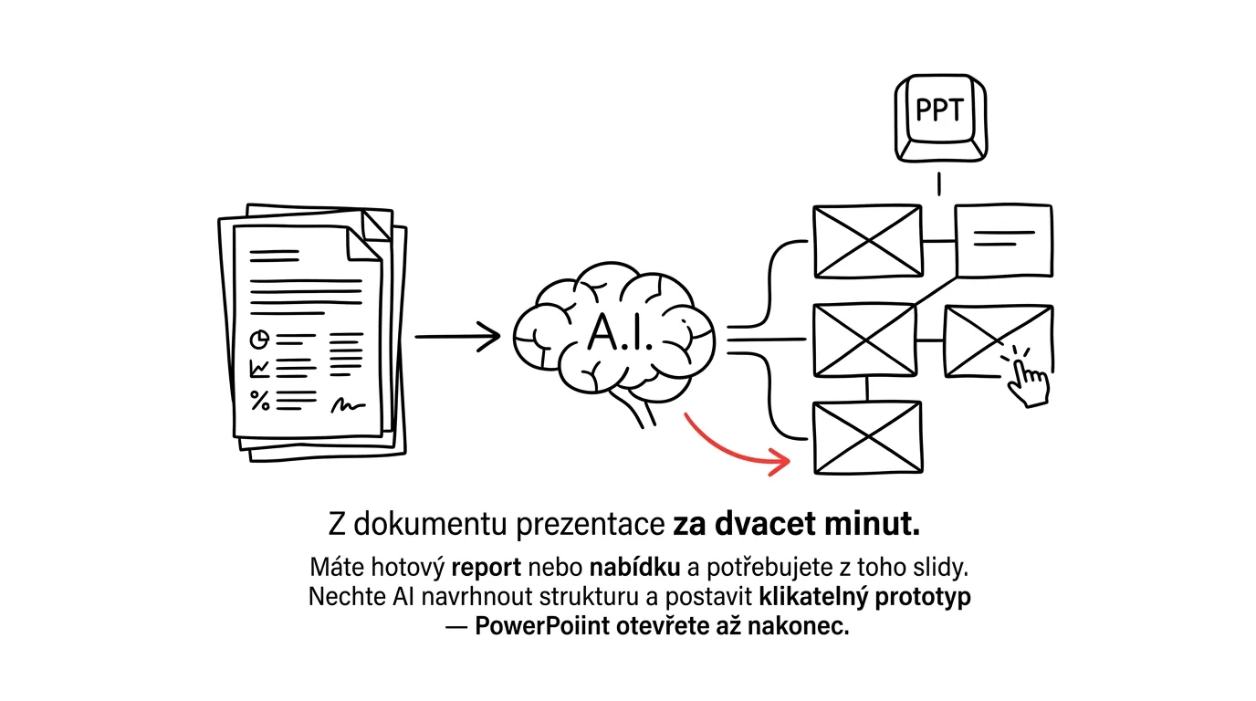
The worst way to build a presentation is to open PowerPoint and start typing on the first slide. You instantly get tangled up in fonts, bullets, and alignment, while the hard question — what am I actually trying to say, and in what order — goes unanswered. Yet the source material usually already exists: a report, a proposal, a strategy doc, meeting notes. Get the structure right first, and only then worry about the visuals — doing it the other way around is where most of the time you lose on presentations goes.
This guide walks you from a finished document to a delivered presentation in seven phases. Each one comes with prompts to copy, along with a note on what it returns and where it typically goes wrong. You don't have to go through all of them: if you've already signed off on the outline, start at phase 3; if you're making a third version of the same presentation for a different audience, skip straight to phase 5.
Two rules sit above the whole process. Slides are not a document — anything that doesn't fit into three bullet points belongs in the speaker notes or an appendix, not on the screen. And AI proposes, the person approves: every number on a slide has to match the source document, because the model rounds, merges, and sometimes invents things while compressing. Checking the numbers is the last ten minutes of work you can't skip.
A typical scenario
Product manager Jana has a sixteen-page report on pilot results and two days to present it to leadership in twenty minutes. Her usual approach: open the company template one evening, spend three hours copying paragraphs onto slides, end up with twenty-eight slides packed with text nobody can look at. She'll skip half of them during the meeting, and never get to the last third at all — the one with the recommendation the whole meeting was called for.
This time she starts differently. She uploads the report and writes up the context: who's in the room, how many minutes she has, and what decision she needs from them. Two minutes later she has an outline of eleven slides, each headline phrased as a claim. In the outline she immediately spots two things she wouldn't otherwise have caught until Friday: one number from the report doesn't actually support the conclusion, and there's no slide on the cost of expansion at all — exactly the first question the CFO will ask.
She reorders things, has the text compressed into bullets, and gets a clickable prototype built as an artifact. She clicks through it out loud with a stopwatch running: twenty-six minutes, so she cuts three slides and merges two. Only now does she open PowerPoint and lay the polished structure into the company template. Total: twenty minutes to a usable first draft, an hour to final visuals. The two hours she saved aren't even the main point — the main point is that the meeting actually got to the recommendation, and she left with a decision.
Phase 1: a brief instead of a task
The difference between a usable and a useless presentation is decided before the first slide exists. “Turn this into a presentation” gets you back a document retold as slides — the model doesn't know who you're talking to or what you want from the audience, so it spreads the content out evenly and highlights nothing. A brief is five lines and changes everything.
Four things you need to say
Audience. Leadership, a team, a client, a committee, the public — each wants something different. Leadership wants the conclusion up front and a chance to ask questions. A team wants the process so it can act on it. A client wants the benefit to them, not a description of your work.
Time. Twenty minutes isn't “about half an hour” — it's a hard limit that determines how many slides you get. Plan on roughly one slide per minute to a minute and a half for content slides; title and transition slides count as zero.
A decision or an action. What should the audience do once you're done talking? Approve a budget, pick an option, start using a new process, or just learn about something new? A presentation without an intended outcome is a lecture, and lectures get planned differently.
Setting. A meeting room with a projector, a video call, a big auditorium, or is this going to be emailed out with nobody talking anyone through it? That last case is a trap: a deck that gets forwarded has to be readable on its own, so it follows different rules than slides you're presenting live.
I'm uploading a [report / proposal / strategy doc] that's [16] pages long.
I don't want any slides yet. I want a presentation brief.

Context:
- Audience: [company leadership, 5 people, not technical]
- Time: [20] minutes, [5] of which for questions
- The decision I need from them: [approve expanding the pilot]
- Setting: [meeting room, projector, I'll be presenting live]
- What they already know about the topic: [they know the pilot exists,
  not the results]

Give me:
1. One sentence the audience should remember if they forget everything else
2. Three arguments that support that sentence, ranked by strength
3. What in the document is irrelevant to this audience and should be cut
4. Three questions this audience will ask me — and whether the document
   answers them, or I need to dig up the answer myself

Keep it brief, no preamble.
You'll get back a skeleton that shows whether your document can even support what you're asking of it. Point 4 is the most valuable and the most often skipped: if the document doesn't answer a question it's going to get asked, better to find that out now than at the table. Watch out for point 1 — the model likes to phrase the takeaway sentence in generalities (“the pilot produced positive results”). Insist on specifics: if it doesn't contain a number or a decision, rewrite it yourself.
One sentence up front, not at the end
The classic mistake is holding the conclusion back like the twist in a detective novel. For work presentations, the opposite works: state the conclusion on the second slide and spend the rest of your time backing it up. That way leadership can interrupt and ask questions, and even if the meeting ends after ten minutes, the main point has already landed. Build it like a mystery, and if you run out of time, the audience leaves without the point.
Phase 2: a slide outline, not text
This is where — and only where — the structure gets decided. An outline is a list of slides, each with a headline and one sentence about its purpose, nothing more. Its huge advantage: you can reorder it in ten seconds. Once slides are laid out and designed, nobody reorders them, because that means an hour of moving text boxes around. Most badly structured presentations aren't badly structured on purpose — nobody wanted to take them apart again.
One slide, one idea
The rule that solves ninety percent of overloaded slides. If a slide needs the word “and” to hold two ideas together, that's two slides. The practical consequence: you'll end up with more slides than you're used to, but each one takes thirty seconds and the audience keeps up.
The second rule is about headlines. Write headlines as claims, not labels. “Results” is a label — it says nothing, and the audience has to decode the chart themselves. “The pilot cut complaints by a fifth” is a claim: anyone who arrives late or is checking their phone gets the slide from that one line alone. When you're done, read just the headlines in order — they should read as a coherent story. It's the fastest quality check for a presentation I know.
Based on the uploaded document, propose a presentation outline for
this brief:

Audience: [leadership, 5 people]. Time: [20] minutes. Goal: [decision
on expansion].
Main takeaway sentence: [paste the sentence from phase 1].

Rules:
- 10 to 12 slides, one slide = one idea
- phrase every slide's headline as a CLAIM, not a label
  (not “Results,” but “The pilot cut complaints by a fifth”)
- the conclusion and recommendation go near the front, not the end
- for each slide, write: number, headline, one sentence on its purpose,
  and where in the document the content comes from (page or section)
- for slides that need a chart or table, mark that instead of text

At the end, separately write:
- what you left out of the document and why
- what's missing from the document that the audience will ask about

Don't write any bullet points or slide text yet.
You'll get back an outline table with references into the document, so you can look up every slide. The last block is the most useful again: the list of gaps. Check whether the model dropped something that matters to you — it tends to cut details it thinks won't “tell the audience anything,” but without them the audience won't trust you. And verify that the claim-style headlines are actually backed up: the model sometimes turns a cautious “suggests” in the report into a confident “proves.”
The headline test
Once you have an outline, run this one-minute check before moving on.
Here's the list of my slide headlines in order:

[paste headlines, one per line]

Answer four things:
1. Does the sequence of headlines make sense as a continuous piece
   of writing when read one after another? Write it out for me as a
   paragraph and flag where it stumbles.
2. Where is a logical step missing — i.e., where does the listener
   have to guess how we got from one slide to the next?
3. Which two headlines say essentially the same thing and could be merged?
4. Which headline is just a label and not a claim? Suggest a rewrite.

Don't touch the slide content, just the sequence of headlines.
Point 1 is the whole point of the prompt: a presentation whose headlines don't read as a coherent story doesn't have a narrative, and the audience will experience it as a set of unrelated facts. Point 3 usually saves you two slides, which is three minutes of meeting time.
Reorder now
With the outline in hand, feel free to rearrange anything. Typical moves that take a minute now and an hour later: pulling the recommendation forward, merging two methodology slides into one, cutting historical context everyone in the room already knows, and adding a cost slide because it's going to come up anyway.
Phase 3: compressing text into bullets
A paragraph from a report is not a bullet point. A pasted-in paragraph runs forty words; the audience starts reading it, stops listening to you, and then you read out loud what they just read themselves. People can't read and listen at the same time — they get either the text or you, not both.
A hard word limit
Set a limit and hold to it: at most three or four bullets per slide, each under ten words. Anything that doesn't fit isn't lost — it goes into the speaker notes. This limit is uncomfortable exactly the way it should be: it forces you to decide what actually matters on the slide.
Here's the presentation outline and the source document.
Write me the slide content according to this outline:

[paste outline]

Rules for each slide:
- keep the headline exactly as it is in the outline
- at most 4 bullets, each under 10 words
- bullets aren't sentences: no passive voice, no “it can be said that,”
  no subordinate clauses
- specific numbers YES, vague assessments NO (“significant improvement”
  gets replaced with the actual number)
- no number that isn't in the document — if you don't have it, write
  FILL IN: [what]
- under each slide, write a separate “Notes:” block with three to five
  sentences I'll say out loud that won't be on the screen

For slides with a chart, write instead of bullets what chart belongs
there, what data feeds it, and what its headline should say as a claim.
You'll get back complete slide content including notes. Always check three things. First, the numbers — check them against the document; the model rounds while compressing and sometimes merges two different numbers into one claim. Second, the level of certainty: cautious phrasing from the report often turns into confident claims on slides. Third, bullets that are still sentences — if more than two slides break the ten-word limit, send the text back and ask for a shorter version.
When there are still too many bullets
This slide has [7] bullets and is unreadable:

[paste slide content]

Give me three ways to simplify it:
A) Cut it down to 3 bullets — what goes and why the audience doesn't need it
B) Split it into two slides — with a suggested headline as a claim for each
C) Turn it into a simple visual (chart, diagram, a three-row table) —
   describe what would be on it and what it would show at a glance

For each option, say what happens to the cut content: into speaker
notes, into an appendix, or gone entirely.
Option C is usually the right one and nobody thinks of it. A twenty-row table belongs in the appendix; the slide gets the three rows that actually carry the argument.
Numbers and charts
A chart on a slide has one job: show what the headline says. If the audience needs more than five seconds staring at it to get the point, it's a bad chart. Practical rules: one data series unless you're comparing, labels right on the lines instead of a legend, the part you're talking about highlighted, and no 3D. For slides, a complicated chart is always weaker than a simple one with a good headline.
Phase 4: a clickable prototype as an artifact
This is the step missing from most people's process, and it saves the most time. Before you lay anything out in PowerPoint, have the presentation built as a clickable page right in the chat. Claude can build an artifact — a working mini-app you open and click through with arrow keys like an actual presentation. There's more on artifacts in the tip Artifacts as mini-apps.
Why it works: you only learn a presentation's flow, length, and rhythm by walking through it. And when something's off in the prototype, you fix it with one sentence in the chat — instead of moving text boxes around in a layout you've already finished.
Build me a clickable presentation as an artifact from this content.

[paste slide content from phase 3]

Requirements:
- one slide per screen, controlled with left/right arrow keys and
  the spacebar
- 16:9 aspect ratio, large text readable from a distance
- headline at the top, bullets below it, slide number and total count
  at the bottom
- for slides with a chart, just a gray placeholder box for now
  describing what chart will go there
- restrained look: white background, dark text, one accent color
- pressing N toggles the speaker notes view below the slide
- an overview of all slides side by side at the end

No animations or transitions.
You'll get back a working presentation you can click through immediately. Two things to watch for: keep the look deliberately plain, because at this stage you're judging structure, not design — a good-looking prototype tempts you to overlook a structural problem. And the prototype isn't the deliverable: don't send it instead of the presentation, it's for debugging.
Click through it out loud with a stopwatch
Open the prototype, start a stopwatch, and go through the presentation out loud, as if the audience were sitting in front of you. Don't whisper it or read it with your eyes — speak. You'll find out three things you'd never learn staring at the screen: where a transition sentence between slides is missing, which bullets you can't actually explain (usually the ones you didn't write yourself), and how far over time you are. Usually about a quarter.
I just went through the presentation out loud and it took me [26]
minutes; I have [20] including questions. Here's the slide content:

[paste content]

Suggest what to cut so I fit into [15] minutes of talking:
- which slides to merge (write out what the merged headline would say)
- which to cut entirely, and what gets lost
- which to move to a backup section after the closing slide, in case
  someone asks

The recommendation and the main argument can't be cut. Rank the
suggestions by how little they affect clarity.
The “backup slides after the conclusion” category is underrated: keep them ready, and if someone asks about a detail, jump to them instead of explaining with your hands. It looks prepared and costs zero minutes of presentation time.
Phase 5: speaker notes
Speaker notes are the most underrated feature of presentation tools. They're private notes only you see, on your own screen, while the audience sees the slide. Everything you cut from the slides belongs here — detailed numbers, sources, sentences you want to say exactly right, and answers to the questions you expect.
What matters is how they're written. Notes are not a script to read aloud. Read a block of continuous text and it comes out flat — and people can tell. What works is bullet points: a fact, a number, one exact phrase you don't want to fumble, and a transition line to the next slide.
Here are my slides. For each one, write speaker notes in this format:

- MAIN POINT: one sentence I have to say even if I'm rushed
- 3 bullets with details, numbers, and context for this slide
- TRANSITION: a half-sentence that gets me to the next slide
- LIKELY QUESTION: what might get asked about this slide, and how
  I'll answer

I'm writing these for myself, so keep it terse, not flowing prose.
Don't write anything that's already visible on the slide — the notes
should add to it, not repeat it. For numbers, note which part of the
document they come from so I can find it if asked.

[paste slide content]
You'll get back notes you drop into your presentation tool under the slides. Check the likely-question block especially — the model guesses at these from the content and sometimes misses what's actually sensitive at your particular company. Add two or three questions of your own that you already know are coming.
Transitions are what hold a presentation together
Most presentations fall apart into a set of unrelated slides because the speaker says nothing in between them. A transition sentence (“which brings us to cost, because without it that decision can't get made”) takes three seconds and holds the story together. Prepare them in advance — improvising transitions while also watching the clock is unnecessarily hard.
Phase 6: different audiences from the same document
One report easily becomes three different presentations, and it's the best return on the whole process — you've already uploaded the document once, you already know the brief, only the audience changes.
Leadership: five slides. The recommendation, three arguments, cost, and risk. Methodology detail goes in the appendix. The goal is a decision, not understanding.
Team: twenty slides. The process, concrete steps, who does what and by when, where the materials are. The goal is that people can work from it.
Client: ten slides. Their problem, what you're going to do about it, what they get out of it, cost, and what happens next. Your own work only gets described to the extent they care.
Using the same document you already have, create a second version
of the presentation.

Original version: [leadership, 20 minutes, decision on expansion].
New version: [team of 8, 45 minutes, goal = they can start working
from it next week].

Change the following based on the audience:
- what matters to them and what to drop instead
- the level of detail (here they need the process, not arguments for
  a decision)
- what questions they'll ask and where I should answer them
- where a task with a name and a deadline should replace text

Give me an outline (headlines as claims + slide purpose), not finished
text. At the end, list which slides from the original version can be
reused unchanged, which need to be rewritten, and which are new.
That last paragraph saves work: usually a third of the slides turn out reusable, so the second version is an hour, not an afternoon. Don't give in to the temptation of sending leadership's version to the team with a “they'll read it” — a presentation built for a five-minute decision is useless as something to work from.
The version for emailing out
A special case that trips people up the most. Slides nobody talks through have to make sense on their own, which means they need more text — but then they're bad for projecting. The fix isn't a compromise, it's two versions.
I now need to send this presentation to people who weren't there
and won't have anyone talking them through it.

[paste slide content + speaker notes]

Turn it into a version for reading:
- add the key points from the speaker notes into each slide so it
  makes sense without a presenter
- add one summary paragraph under each slide (max 60 words)
- add a “Key takeaways” slide at the start with three points
- add who to contact and by when a decision is needed, at the end

Leave the claim-style headlines unchanged. Don't change the numbers
or the conclusions.
The best version to send out is often a PDF with notes under the slides — you print it straight from the presentation tool and don't have to write two separate documents. Then keep the version you actually project lean.
Phase 7: laying it out in the company template
Only now do you open PowerPoint or Google Slides. The structure is settled, the text is compressed, the notes are written — what's left is craft, and with good prep it takes twenty minutes.
Master slide first, then slides
If you don't have your template properly set up, start there. The master slide (Slide Master in PowerPoint) holds fonts, colors, positions, and footers in one place, so a change applies everywhere at once. Without it you'll spend an hour aligning things by hand and it'll still look inconsistent. There's a guide in the tip a PowerPoint master template.
The layout itself follows a simple process: create slides from a master layout (not by copying text boxes), drop in the headlines and bullets from your finished content, copy the notes into the notes field, and insert charts as captioned images. Don't try to improve the text at this stage — anyone who starts rewriting during layout ends up with an inconsistent presentation at midnight.
When you don't have a template
Then the fastest route is a finished look from somewhere else: Canva and similar tools have usable templates, and the result looks decent without a designer. The other option is to keep it deliberately plain — a white background, one sans-serif font in two sizes, one accent color. A restrained presentation never looks bad; a botched “designed” one does.
Check before you send it
Here's the final content of my slides and here's the original document
they came from. Do a check and just return a list of findings, don't
rewrite anything:

1. Numbers on the slides that differ from the document or aren't in
   it at all — for each one, give the slide and the value in the document
2. Claims that are stronger than the wording in the document
   (the document says “suggests,” the slide says “proves”)
3. Slides with more than 4 bullets, or a bullet over 10 words
4. Headlines that are labels instead of claims
5. Data that shouldn't leave the company (client names, internal
   pricing, personal data) — just flag where it is

[paste slide content]
Do points 1 and 2 every time, even in a hurry. A wrong number on screen is the fastest way to lose the audience's trust in the rest of the presentation — and once someone in the room catches it, nobody's talking about the content anymore.
Phase 8: present, don't read the slides
The last phase is the reason the whole process exists. Slides are anchors, not a script. The audience watches you; the slide just shows where we are in the story. When you read aloud what's on the screen, the audience does the one reasonable thing available to them: they stop listening and read it themselves, faster than you can talk.
Practical habits that fix it. Explain the slide, don't repeat it — the audience can see the headline, you talk about what's behind it. Look at the room, not the screen; if you need to check what's on the slide, that's what the notes on your own monitor are for. Leave silence after an important number — two seconds is enough for it to sink in. And black out the screen when you want attention back on you: pressing B blacks out the screen in both PowerPoint and Google Slides, see the B key. Useful during discussion, when a glowing slide is just a distraction.
Before the real run, go through the presentation once more from the start, ideally out loud and without an audience. Shift+F5 starts the presentation from the current slide, which saves clicking through when you're practicing one passage repeatedly.
Rehearsing tough questions
Tomorrow I'm presenting this content to [audience]:

[paste slide content]

Play the most difficult person in the room — someone who's against
the plan and looking for weak points. Write:
- 8 tough questions that could catch me off guard
- for each, which slide should have room for it
- for each, a three-point skeleton of a good answer
- 3 questions my material doesn't have a good answer to, and how to
  admit that honestly without losing the argument

Ask about my numbers and my conclusions, not the topic in general.
You'll get back a list of questions to run through out loud. The last point is the most valuable: admitting “I don't have that, I'll find out by Friday” always beats an improvised answer someone later shoots down. A tougher version of this rehearsal, including defending your conclusions, is in the tip AI as your opponent.
Common mistakes
- Opening PowerPoint right away. Formatting looks like work for the first hour, but it's avoiding the hard part — deciding what to say and in what order. Structure first, visuals last.
- Letting AI “make a presentation” with no brief. Without an audience, a time limit, and a goal, you get a document retold and chopped into slides: even, vague, and pointless.
- Pasting in paragraphs instead of compressing them. A slide with a paragraph of text is a document projected on a wall. The audience starts reading it and stops listening.
- Not checking numbers against the original. Models round, merge, and escalate certainty while compressing — “19% in the pilot group” easily becomes “a fifth overall.” Check every number on a slide against the source.
- Pasting sensitive material into a free chat. Internal numbers, client data, and proposals belong on a paid or business account with contractual data protection; anonymize what you can before you upload it.
- Reading the slides out loud. The fastest way to lose the room. The slide is an anchor; the content lives in you and in the speaker notes.
- Making one presentation for every audience. A leadership version doesn't work as a working document, and vice versa. A second version is an hour of work, not an afternoon.
The best tools
- Claude — brief, slide outline from an uploaded document, compression into bullets, and above all the artifact as a clickable prototype where you tune the flow before layout.
- Projects in Claude — when you present to the same audience repeatedly, save your company context and slide rules into a project; you won't have to write them out every time, see projects as persistent context.
- PowerPoint and Google Slides — where the final deliverable gets made; with a set master template and a finished structure, this is the fastest part of the process.
- Speaker notes — the place for everything you cut from the slides: details, sources, transitions, answers to questions.
- Canva — when you don't have a company template and need a decent look without a designer.
- Presenter mode on a second monitor — notes, a stopwatch, and a preview of the next slide; the one setting that genuinely changes how you come across.
What you get out of it
- Time: roughly two hours per presentation. The biggest saving isn't in writing the slides, it's in not rebuilding a finished layout — reordering takes ten seconds in an outline and an hour once slides are designed.
- Money: indirectly, but noticeably. A presentation that reaches its recommendation and produces a decision saves a second meeting with the same people — with five people and an hour of time, that's the most expensive line item in the whole process.
- Structure: logical gaps in your argument show up in the outline, where they get fixed in a minute, not the day before the meeting. The headline test catches a missing step before the audience does.
- Peace of mind: you go into layout knowing the structure holds and that you've walked through the presentation out loud with a stopwatch. What's left is craft, not decision-making.
- Quality: the one-idea-per-slide rule is much easier to hold to when someone other than the author is doing the compressing — and a claim-style headline forces you to say what you're actually claiming.
Pro tip
Before you lay out anything, have the whole presentation summarized into one sentence the audience should walk away with, then check each slide against it: does it add something? Slides that just “add context” are usually the exact ones you run out of time for — and if you cut them in advance, nobody notices.
An advanced version for people who present often: set up a project with persistent context that holds your company's slide rules, an example of a good presentation, and a list of the audiences you speak to. Then all you need is to upload a document and write “leadership, twenty minutes, budget decision” — the brief and the outline come out matching your conventions, and you don't have to spell them out every time.
And the rule that sits above everything else: AI proposes, the person approves. Check every number on a slide against the original document, check every claim against what you're willing to defend, and only put sensitive material into a paid or business account with contractual data protection. You're the one standing in the room, not the model.
Want to go deeper? The handbook has a whole chapter on it — AI and automation.
Similar tips
Cornell Notes, Stripped Down: A Folded Margin and a Summary Line
The most effective note-taking format doesn't need a template: fold a margin for questions and leave a line at the bottom for a summary. Your notes turn themselves into a practice test.
Delete word by word, not letter by letter
Ctrl+Backspace
Ctrl + Backspace deletes the whole word to the left, Ctrl + Delete the whole word to the right. Typos disappear in one go.
Ctrl+F: don't read the page, search it
Ctrl+F
Looking for a specific piece of information on a long page? Ctrl+F and a few letters get you there in two seconds.
Common questions
Why isn't “turn this into a presentation” enough?
Because the model doesn't know who you're talking to or what you want from the audience — it returns a retold document chopped into slides, even and pointless. A brief is five lines and changes everything: audience, time, the decision you need, the setting, and what the listeners already know.
Where does the conclusion go — the beginning or the end?
The beginning. The classic mistake is holding the conclusion back like a detective story's twist — in work presentations the opposite works: state the conclusion on slide two and spend the rest of the time supporting it. Even if the meeting ends after ten minutes, the main message has already landed.
How do I know the presentation's structure is good?
The headline test: write headlines as claims, not labels (“The pilot cut complaints by a fifth” instead of “Results”), and when you read them in order they should form a coherent story. It's the fastest quality check there is — and make reordering changes in the outline, where they take ten seconds, not in the finished layout.
Do I have to check the numbers AI put on the slides?
Always — the model rounds, merges, and escalates certainty while compressing: “19% in the pilot group” easily becomes “a fifth overall” and a cautious “suggests” turns into a confident “proves”. Checking against the source document is the last ten minutes of work you can't skip — a wrong number on screen takes the audience's trust in the rest with it.
What's the clickable prototype for if I'll end up in PowerPoint anyway?
You only learn a presentation's flow, length, and rhythm by walking through it — you click through the artifact with arrow keys, out loud, with a stopwatch, and fix things with one sentence in the chat instead of dragging text boxes. You'll typically find you're a quarter over time. But the prototype isn't the deliverable: it's for tuning, not sending.
Can one presentation serve leadership, the team, and the client?
No — leadership wants five slides and a decision, the team twenty slides and a procedure, the client ten slides about their own benefit. But three versions come cheap from one document: usually a third of the slides carry over, so the second version is an hour's work. And slides sent by email are their own genre — they have to work without a speaker.
Was this helpful?
Liked this tip?
I send one like it every week by email. Two minutes to read, hours saved.
The Top 30 tips e-book, free — it lands in your inbox right away.
Then 1 tip a week · no spam · unsubscribe in one click
Prefer a system to single tips? The free email course — seven days, seven emails, one skill a day.